

Digital Travels
A responsive website tailored for the Digital Travels software—a comprehensive business management portal designed exclusively for tour and travel agents. This website serves as the primary platform for showcasing the full spectrum of client services offered, while also providing a secure login gateway for potential clients to efficiently manage their travel business operations.
RESPONSIBILITIES
User Research
Wireframing
TOOLS
Figma
CLIENT
Global Digitech
DURATION
80 Hours
Figjam
Brand Design
Prototyping
Usability Testing
Background
Digital Travels, operated by Global DigiTech, is a cloud-based platform designed to revolutionize travel management for agents. Offering a comprehensive suite of features including booking management, billing, cancellations, voucher creation, accounting, and reporting, including GST Reports.
Global DigiTech, with six years of experience, is committed to continuously enhancing its software to address the evolving challenges of the broader market. Digital Travels, known for its user-friendly interface and precise accounting, is poised to solidify its position in the competitive travel industry.
Problem
The existing Digital Travels website fails to effectively showcase the portal's comprehensive features. Additionally,
a substantial 40% of potential leads remain unconverted due to the perceived lack of an appealing UI and professional design. Slow loading times further exacerbate user dissatisfaction, collectively affecting user engagement and conversion rates.
Solution
To overcome this challenge, we propose a two-step strategy: redesign the website, thereby changing the UI of the whole portal to enhance the user experience and advance the functionality. Additionally, we will optimize performance to enhance loading times for a seamless user experience.
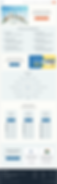
Desktop View
Mobile View


Stakeholder Interview
I engaged in a discussion with the owner and technical head of Global Digitech, the software provider for Digital Travels, to understand the organization's needs and challenges. Here are the key insights from our discussion:
Organisation Needs
◉ Boost website engagement to captivate users effectively.
◉ Integrate a dashboard application for an enhanced user experience during the portal revamp.
◉ Offer a complete service overview through the website for a holistic representation.
◉ Resolve customer issues tied to vibrant colors, notably red, for improved user satisfaction.
Success Metrics
◉ Increase in conversion rate of prospective B2B clients.
◉ Reduction in existing client remarks regarding the user interface.
◉ Fewer maintenance incidents.
◉ Enhanced user experience through the dashboard.
‘During our discussion, they outlined their key competitors from their perspective, which I further analyzed in my competitive analysis.’
Competitive Analysis
I researched the four primary competitors, evaluating their strengths, weaknesses, and features. Among them, some directly compete with our firm, while others exemplify the type of software Digital Travels aspires to become.

This research enabled me to think of some opportunities for Digital Travels to set it apart:
◉ To enhance interactivity on the website, I propose incorporating illustrations.
◉ The ability for clients to sign up and create their accounts.
◉ Clean user interface throughout the portal.
◉ Facilitating B2B users with seamless integration into their portal.
User Interviews
With preliminary competitor research and an evaluation of the existing website, strengthened by insights from Global Digitech's director, I crafted an interview guide. I proceeded to engage in one-on-one discussions with five existing members, delving into their experiences using the website, navigating the portal, and beyond. These interviews provided
a thorough understanding of the strengths, weaknesses, and challenges of using digital travel.
Data Synthesis

I gathered all the insights from the user interviews and clustered them into patterns of thoughts that outlined the goals, motivations, pain points, and needs of the user. A full view of the affinity map can be viewed here.
A software website should convey a professional appearance and instill a sense of security.
Understanding if I'm growing or stuck is hard for me because I'm not familiar with accounting.
When I buy software, I expect it to have all the tools I need to run my business effectively.
Personas
Following the acquisition of key insights from the interviews, I classified users into two distinct persona groups, each exhibiting unique needs, motivations, and pain points.
.png)
Project Goals
Business Goals
◉ Addressing the needs of both
B2B and B2C users.
◉ Fewer user interface-related issues
are reported.
◉ Prioritize Customer Feedback and
improvement.
Mutual Goals
◉ Clear information about features
offered.
◉ Dashboard application for better
analysis of growth and stagnance.
◉ Easy to navigate website.
◉ Design that looks interactive and
professional.
User Goals
◉ Demo video available for every
feature.
◉ A portal with a consistent layout
throughout.
◉ Functionalities to manage their
complete business.
◉ Create an account option
Technical Considerations
◉ Software lags sometimes while
extracting huge data.
◉ SSL impacts portal performance
and absence labels the site 'not
secure'
I created these goals for the project that took into consideration both the business and user goals separately, but also how they unified. This helped me decide on what needed to be focussed when creating the website.
Feature Matrix

I gathered a bunch of features for the website, considering what users had to say and what research told us. I used a ranking system to figure out which features mattered most for our business goals and what users really needed. This way, we could pick the best features that would help our business and make our users happy too.
Task Flows
After establishing my main features, I created three task flows to show how users would most quickly access these three features. This task flow helped me structure the screens that would be needed when creating both the mid and high-fidelity designs.
.png)
Low Fidelity Wireframes
Given 'Digital Travels' extensive page structure, I selected specific screens to prioritize for the initial design. These choices were informed directly by insights gathered from user and director interviews. I began by crafting low-fidelity wireframes to plan the layout for crucial pages like the landing page, sign-in, sign-up, dashboard, and report.

Mid Fidelity Wireframes
Next, I elaborated on my paper sketches to digital wireframes to see how the screens would interact with each other when going through different task flows.

Branding
The Global Digitech team wanted a new look for the Digital Travels logo and style. They needed it to clearly show that it's a tool for travel businesses, not a travel agency itself. So, I redesigned the logo, changed the colors, and picked a new font to match this idea.
.png)
Brand Values
I made these logos using blue and orange colors. Blue and orange represent things like safety, honesty, and being reliable. These colors match well with what my brand stands for Authenticity, Accuracy, and Security.
High Fidelity Wireframes
With the organization's mission and user's goals in mind, I added the existing logo, brand colors, and images to the mid-fidelity wireframes to create my high-fidelity screens which included the homepage, sign-in page, sign-up page, dashboard, and sales report. I made some layout tweaks before arriving at this iteration.
.png)


Usability Testing
I requested feedback from five software users, as well as the technical head and director of Global Digitech, to test and provide insights on my designs. Their feedback was crucial in making improvements to these screens. The main objective of this testing was to determine if the website design was easy to use and practical for users. I wanted to see if users found the website's appearance professional and if they found the new dashboard easy to understand. In essence, I aimed to ensure users had a good experience with the website design and that it met their functional expectations.
These were the key takeaways:
USERS OF DIGITAL TRAVELS
◉ Nearly all users appreciated the color scheme of the
portal, finding it reminiscent of the previous website.
◉ 40% expressed satisfaction with the functionality of the
alert and reminder page, but they were eager to see
how the sales dashboard would operate.
◉ 20% suggested a more detailed presentation of features,
including a brief description alongside the headings, to
provide a better understanding.
DIGITAL TRAVELS TEAM
◉ The Team highlighted concerns about complex text
fields, especially for future use in forms like billing.
◉ The team disliked the secondary color's similarity to the
previous website and suggested exploring different
options.
◉ Users and the team wanted a streamlined sign-up process
with an easily accessible signup button for a quicker and
smoother experience.
Upon getting feedback to enhance the designs, I noticed ample room for improvement. The current look of the website was somewhat traditional, and I aimed to modernize it. I stepped back, took a break, and then revisited the task with fresh eyes. To initiate this change, I honed in on enhancing the
UI kit by adjusting text fields, colors, and icons. Research played a vital role in guiding me and boosting my inspiration. It led me to renovate the style tile and finalize the updated UI Kit. This effort led to a significant improvement in the overall design, aligning it more closely with the contemporary standards we were targeting.
Updated UI Kit

Priority Iterations
Incorporating the new style tile and UI kit, I meticulously sketched and refined the designs, iterating multiple times and adjusting layouts extensively. After a thorough process of refinement, I finalized these designs. Also, to ensure adaptability, I crafted designs for both desktop and mobile interfaces. The primary focus during this design construction was to ensure user-friendliness and deliver a modern, seamlessly functional, and engaging design.
Problem #1: The challenge is to present the website as a software or portal, not as a travel agency, effectively utilizing the featured image on the main page and ensuring detailed feature descriptions, along with an integrated FAQ section for enhanced user assistance.
Before

After

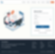
Problem #2: The challenge involved improving the user experience in the sign-up process by optimizing the text field format with appropriate spacing between labels and fields. Additionally, addressing user security concerns was a key aspect of the sign-in process.
Before

After

Problem #3: The challenge was effectively portraying to users how their sales data would be visualized through graphical reports on the dashboard.
Before

After

Final Designs


Full access to the prototype can be viewed Here
Reflection
Challenges
User Research: Convincing travel agents to provide interviews proved difficult, and most of the feedback revolved around desired features for the software
What I could have done differently
Gathered Inspiration: Moving forward, I intend to invest more time in gathering and leveraging inspiration, which I believe will significantly improve the smoothness of my high-fidelity design process
Learning & Next steps
Valuing feedback and practicing patience: As this marked my inaugural real-time project, it provided a significant learning experience. Firstly, it taught me the importance of valuing feedback and understanding the precise expectations of clients.
Secondly, it instilled in me the virtue of patience, knowing that designs evolve through iterations to attain refinement. Having an open and adaptable approach to each new design is crucial, being ready to pivot whenever needed.
Next Steps: Given the comprehensive nature of Digital Travels as a portal, I couldn't design all the key features within the given timeframe. However, I am committed to working further on designing these additional features. Looking ahead, I plan to leverage the skills and insights I've gained from this project for future endeavors